
Documentation research
Reorganizing the navigation to revamp developer experience
DATE
February 22nd - April 29th, 2021 (10 weeks)
STAKEHOLDERS
Documentation Product Manager, Product Management Team, UX Manager
RESEARCH OVERVIEW
Deriving from the Self-service onboarding research insight, Sendbird found the need to give the right hand holding to fill the developers’ desire to achieve their goals with specific guidance and easy-to-find documentation. In fact, the developers felt that the documentation was often difficult to comprehend, and sometimes, even outdated. 19% of our users from Churn Analysis revealed difficulties with documentation, delivering that the developer-related information on our website could not be navigated efficiently.
The documentation research was done to revamp our current documentation which is a big part of developers’ reference material not only during self-led onboarding but also for our customer experience in general. Specifically, we focused on finding out what kind of content should be included in the documentation and how we can reorganize the documentation navigation. We mostly relied on internal data and desk research, including stakeholder interviews, Google Analytics (GA), and Looker overview, and visualized the information architecture (IA). In the end, this research helped to reorganize the layout, creating a new documentation page.
As a UX researcher, I worked with a Documentation product manager and UX manager. As a sole UX researcher, I collaborated closely with the PM in charge and we continued to overcommunicate to streamline the areas of research, making sure we are all on the same page and on the right track. After the launch of the new documentation page, we have continued to follow up with the page view data for evaluation once in two weeks, keeping areas of improvement up-to-date.

Highlights
OBJECTIVE
Reorganize the documentation layout and assets to increase the number of organization counts of the SDK integration. (Short-term wise, increasing the page view counts of each content in the developer funnel: ‘Docs start page’ to ‘UIKit product page’ up by 20% within 2 months)
METHODS
Stakeholder interviews, competitive analysis, behavior flow analysis, heatmap evaluation, information architecture and more.
CHALLENGES
Limited human resources, confusion around having multiple/overlapping data tracking tools, setting the quantified goal, and lack of qualitative research due to time constraints.
RESEARCH INSIGHTS
Documentation is the main accessed resource, with the Developer Portal, a step-by-step guide, coming second.
Developers directly search for what they need from the menu bar on the left of the Documentation page.
Developers spend more time looking through the codes/images rather than reading the text in detail.
RESEARCH IMPACT
Presented and shared the research outcome with the Product management team.
Launched the renewed Documentation page, and set the foundation for the following research step, which involved qualitative validation.
Research question
“How can we reorganize our documentation to give the right hand-holding during the developers’ SDK installation experience?”
Subsequent research questions
What kind of content do developers seek on the documentation page?
How can we reduce the time developers spend on documentation?
Can we reorganize the documentation navigation to be more developer-friendly?
What can we provide developers to efficiently search for information without needing further human support?
Process overview
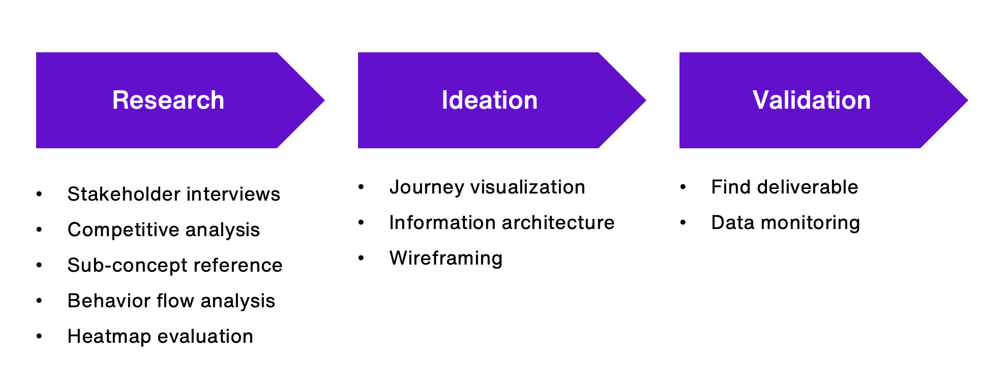
Research
The research was kicked off with the stakeholder interview to accurately identify what components make good Documentation. Based on the interview, I’ve done a competitive analysis to evaluate the emphasis on found components. Next, I referenced sub-concept insights from the Self-service onboarding research to know the difficulties developers faced during the Documentation exploration phase. Moreover, we took a closer look at the quantitative data using Google Analytics and Looker to reference the page views which assisted in defining the reorganization priorities. Using Hotjar for heatmap evaluation also helped us realize the patterns of Documentation view behavior, serving as a guide for designing the final information architecture.
Stakeholder interviews
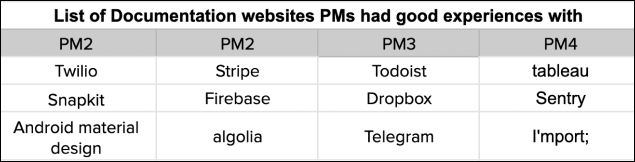
Stakeholder interviews were done as a first step to Documentation revamp research. As the Documentation contains content for all Sendbird products, it was necessary to listen to Product Managers from each Sendbird product (chat, calls, desk, and pricing). I asked the PMs to elaborate on the Documentation they had good experiences with and what made it a good experience. In addition, I received their feedback on the current Sendbird Documentation, needs, and areas of improvement.
Example questions:
Do you think Sendbird Documentation could be better in a certain way? What are those ways and why do you think it should be improved that way?
Please name three companies that come to your mind when we say ‘A good Documentation’.
Why did you choose those three companies? Could you explain in detail how you found each Documentation ‘good’? How do you define ‘good’?
If you could implement one Documentation component to Sendbird Documentation, what would it be and why?
Interview scripts were later used to do a competitive analysis. Based on the list of companies PMs shared, we compared the Documentation components and defined areas of Documentation reorganization in alignment with the sub-concept derived from the previous Self-service onboarding research.

Competitive analysis
Referencing the companies provided by the PMs from stakeholder interviews, we have listed the components in need and the companies to do a competitive analysis. The goal of competitor analysis was to realize the completion of well-developed documentation, the frequency of components in use, and reference the design system. Each documentation was evaluated based on the point system we created below:
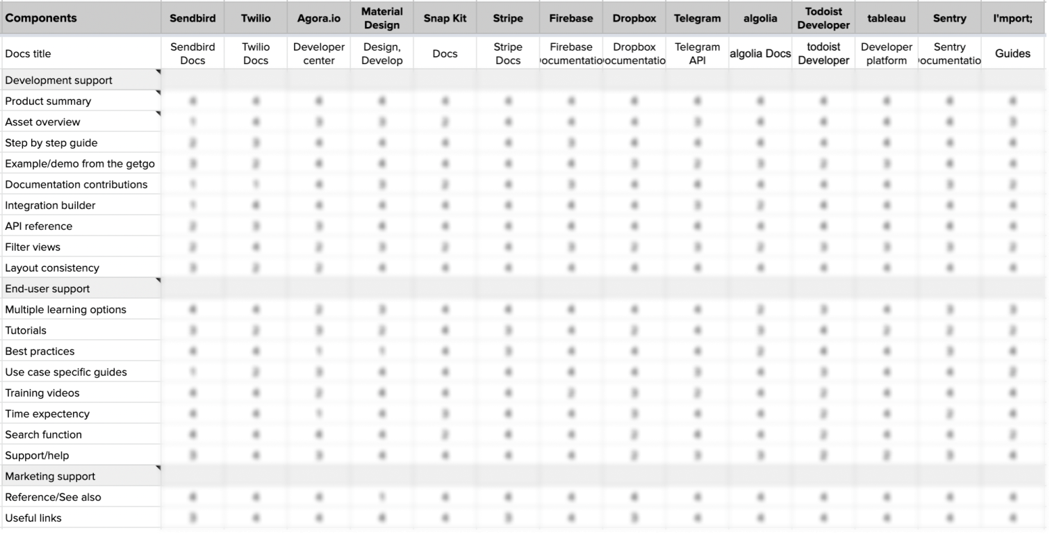
Evaluation scores based on core product:
4 - Complete: The asset is provided in detail, clear layout with possibly multiple options.
3 - Partially complete: The asset is provided but would do better with additional information and a better layout.
2 - Needs revision: The asset is provided with limited information and needs additional work.
1 - Omitted: The asset is missed.
Sub-concept reference
During the ethnographic interviews from Self-service onboarding research, we drew sub-concepts of developers' experience with the documentation. Sub-concepts were critical as they consisted of real user critiques and feedback.
I aligned our internal needs (feedback from Product Managers) and sub-concepts, internal needs being the standard of our areas of improvement and sticking the sub-concepts on the sought areas to quantify the priorities.
Behavior flow analysis
Now that we have gathered the feedback and needs, we needed to take a closer look at our quantified data to assess if the collected qualitative data signify the needed focus areas and to prioritize the reorganization needs in sequence. Google Analytics and Looker were used to reference the unique page views, page views, and percentage of behavior flows. Although our focus was on our documentation, we took a look at our entire sitemap to have a holistic overview of page views.
Through behavior flow analysis, we identified the -
Documentation is the primary accessed resource, with the Developer Portal, a step-by-step guide, coming second.
The pages that remained in the highest behavior funnel were Products and Resources.
The Demos page received higher pageviews than the Blog page in Resources.
Among products, Chat had the highest page views, double the Calls.
Other than the Documentation, the pages with the highest unique pageviews were Pricing and Sign up.
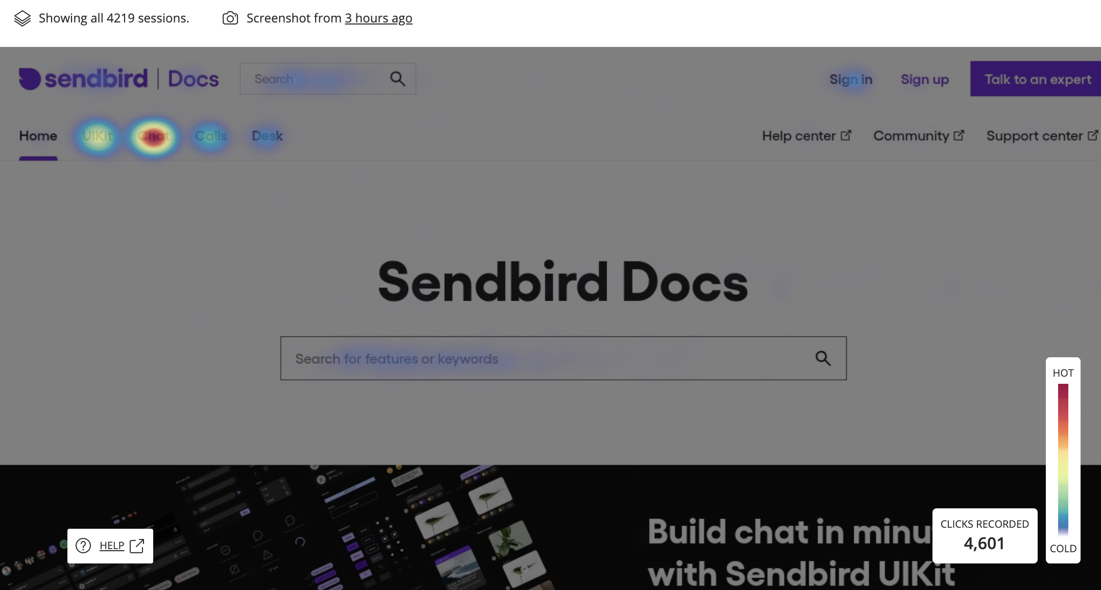
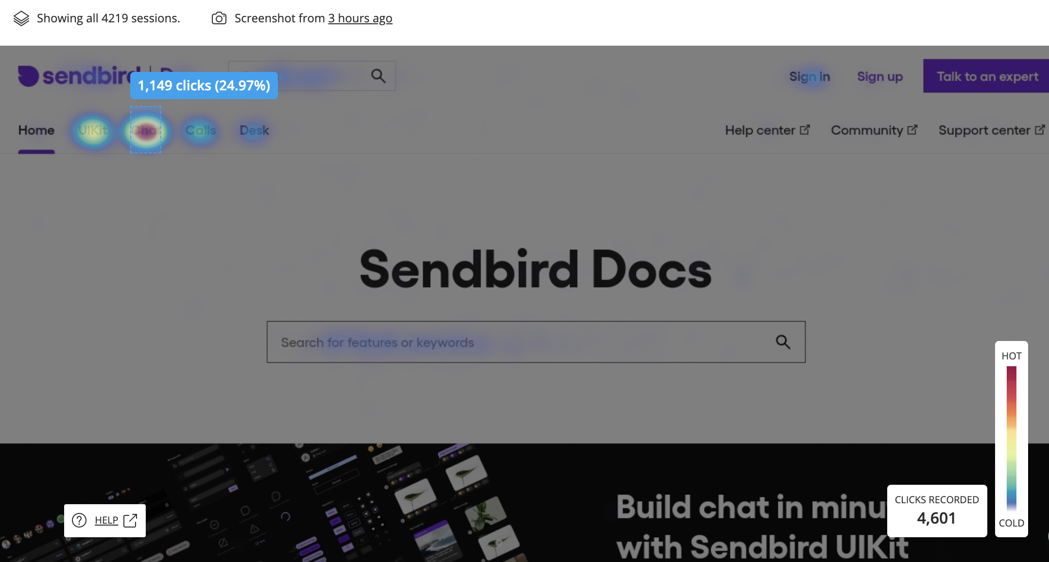
Heatmap evaluation
As the Marketing team was already using the tool called Hotjar, we also used heatmap evaluation to visualize how people behave on our website. In addition, heatmap evaluation was to fill-in-the-gap information of behavior flow analysis.
Although the heatmap provided us with helpful insight into the user funnel of our website, it was not easy for us to find out the user goal and the reasons for behaving in such a way. Furthermore, it displayed multiple nationalities of users without specific user expertise, like their experiences as a developer. It was helpful in visualizing the general behavior patterns on Documentation, serving as a sub-guide for designing the final information architecture.
Through heatmap evaluation, we identified the following -
How search bars are used: users usually type only one or two words and scroll down for the exact information they are looking for.
How the Documentation menu is being used: users tend to search directly for what they need from the menu bar on the left.
How Codes and images are being used: users spend much more time looking through the codes/images rather than reading the text that explains them in detail.
2. Ideation
Through a collaborative data synthesis workshop, I was able to engage different stakeholders with the key research findings and deliver recommendations. The prototyping phase was accomplished together with the UX design team and Documentation Product Manager. With the gathered information from the research phase, we tried to incorporate as many insights as possible and visualize the entire journey of the new Documentation page.
Documentation journey visualization
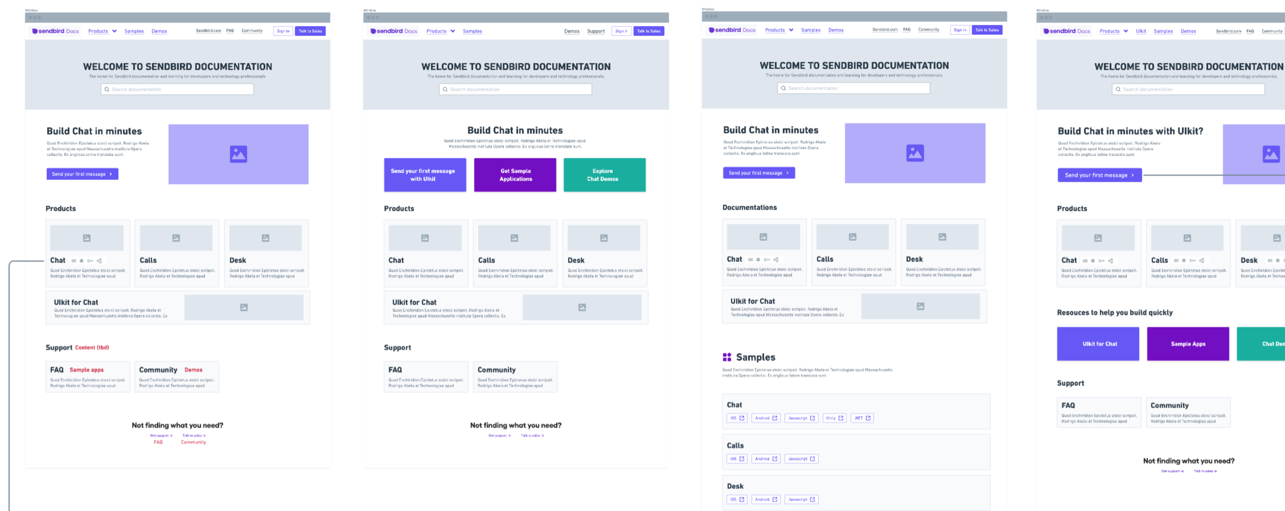
Referencing from the insights from research, we set our design requirements and guidelines for our Documentation revamp. The below shows the high-level requirements we generated to revamp the Documentation page.
Define the ‘developer contents’ and regroup the contents by their purpose
Implement the frequent components in use and add on what we do not have
Implement the #tag system to all of our contents for using them in proper domains
Reorganize the Developer portal’s main page for smoother access to navigate all developer contents
Spot the duplicated contents in different sections to integrate them into one
The visualized Documentation journey map assisted the team in contextualizing and comparing overlapping pain points to identify the best opportunities.
* Partially extracted from the full journey visualization
Information architecture
As we drew the Documentation journey, we have also created a simplified information architecture of our website for more straightforward content labeling and organization.
Looking at the image, the left IA displays the Sendbird website before, and the right IA indicates how we planned to change the sitemap with the Documentation revamp.
We shared a significant amount of time on how and what we should include in Developer content and tried to integrate the contents that were not viewed as much, having our primary focus area on developer-related content like Documentation, Products, and Resources pages. Furthermore, we tried to link the pages that developer-related content could take the user to.
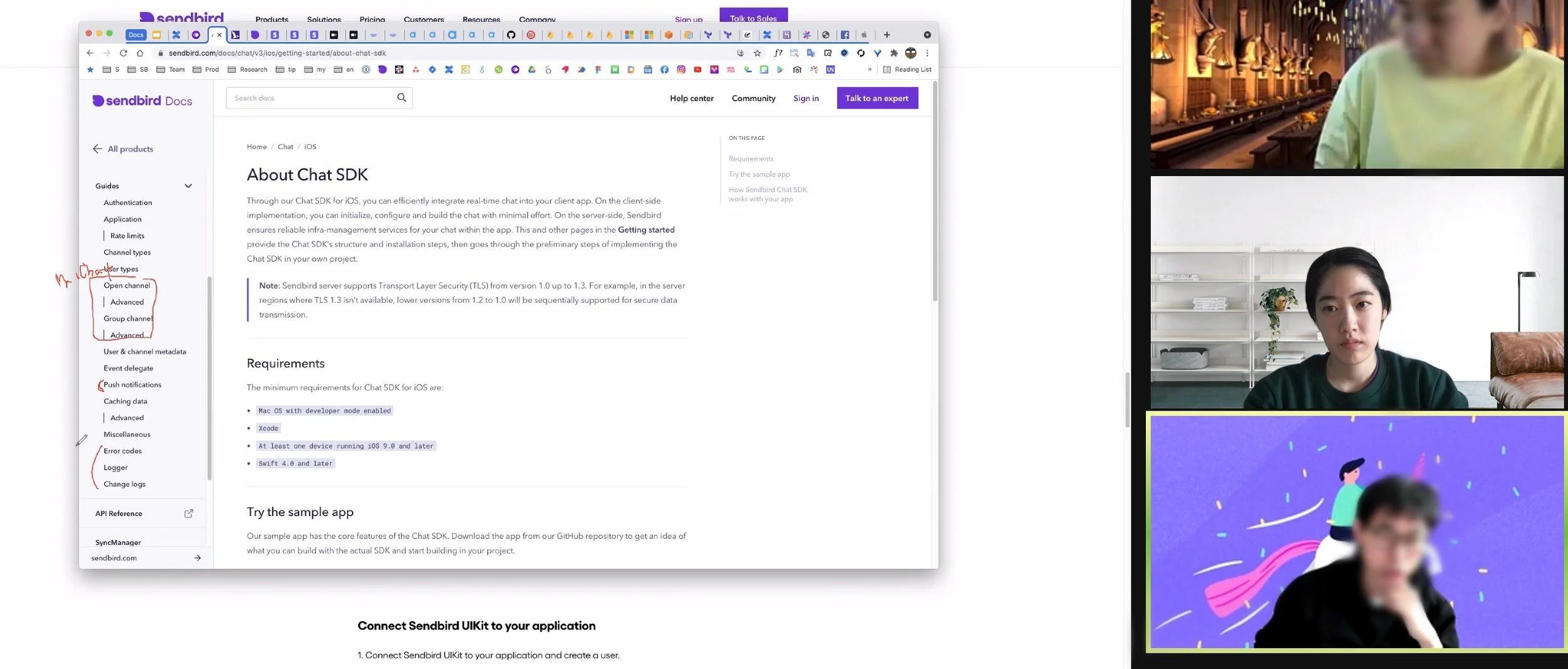
Wireframing
To establish the structure and flow of possible design solutions for our documentation page, our wireframing had two focus areas - search-focused and image-focused. To apply the identified research areas, we tried out different ways of organizing the contents and continued adding to our needs.
* Wireframing done in multiple different ways through workshops with product management team.
3. Validation
Final deliverable
On April 29th, 2021, the new look of our Documentation page was launched (Hooray!). Before the revamp, Sendbird Documentation was rather text-based, with images and icons that were difficult to read unless the text was read. For instance, many developers misunderstood our sample apps’ platform logo that took them to the Github site, thinking it would take them to the platform-specific Documentation page.
Focusing on our search function, we provided clear images and lessened text with the Documentation. We also included more storytelling images, separating the other content, like support pages with different colors and designs. The revamped design initiated actions that had a significant impact.
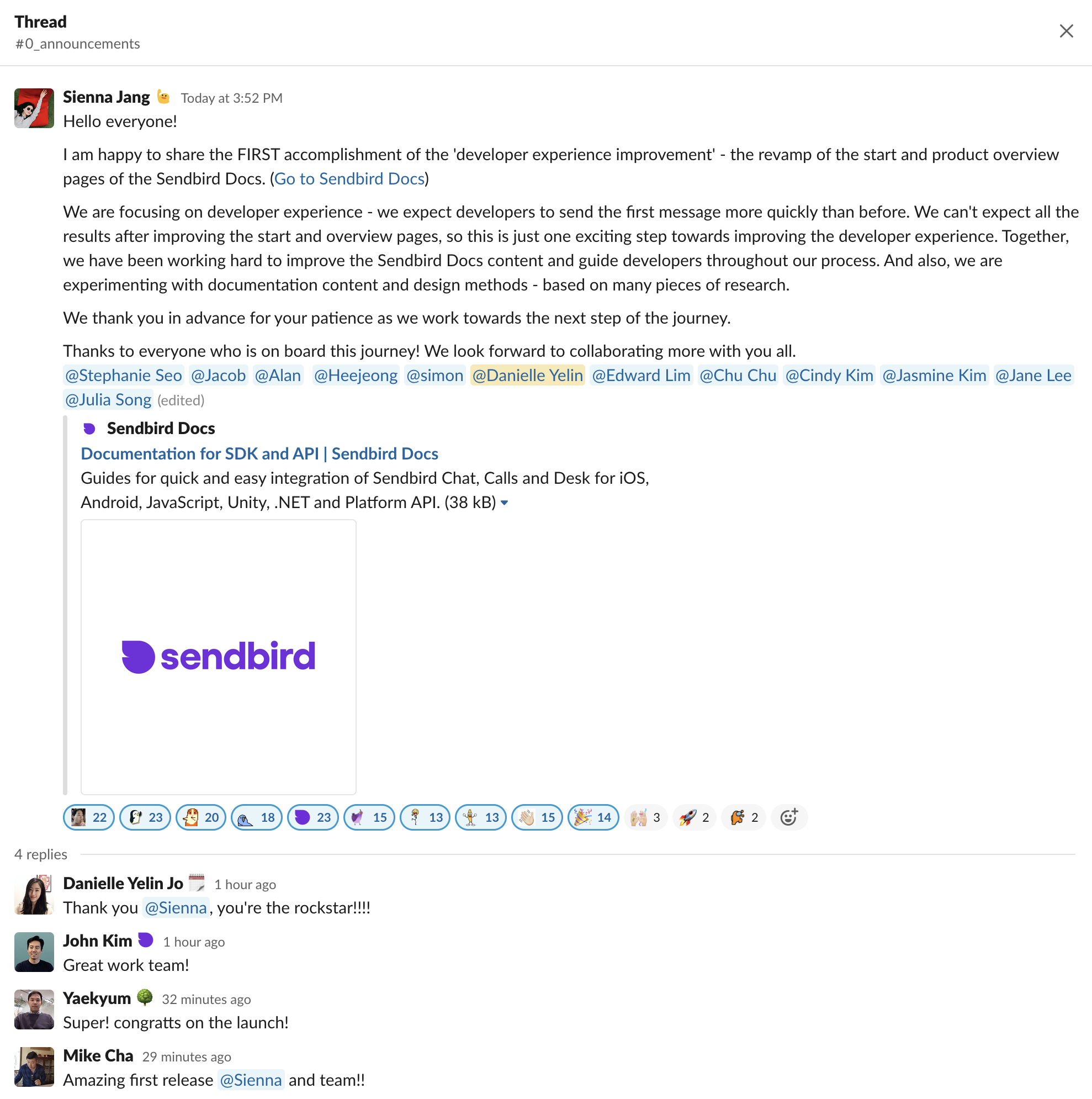
Reference link: https://sendbird.com/docs
Impact
Successfully presented and shared the research outcome with the Product management team, including the Head of Product and VP of Engineering.
Set 2021 goals for our further renewals with our Documentation page.
Set the foundation for the subsequent research, which involved a thorough qualitative validation.
Reached our goal of increasing the page view counts of each content in the developer funnel - ‘Documentation start page’ to ‘UIKit product page’ up by 20% within 2 months
Continuous data monitoring
To continue with our Documentation revamp and measure its success, we set our short-term goal to increase the pageview counts in the developer funnel by 20% within 2 months. The funnel set was from accessing ‘Docs start page’ to ‘UIKit product page’ as it was considered the most critical page of our new Docs site.
Reviewing the data, checking the status, and using those analytics to gain the product and the business insights, we proactively used our tools to track. Notably, we also looked into the increase in self-service to determine if the reorganized Documentation was giving the right hand-holding without customer support from Sendbird.

Reflections
Challenges
Shall we continue to use increasing ‘First message sent’ page view count as our end goal?
Regardless of our short-term goal to increase the pageview counts of the ‘Docs start page’ to ‘UIKit product page’ up by 20% within 2 months, the product team always emphasized that we need to increase the ‘First message sent’ activity in total in the long term. However, does this mean that this user or organization would use our product? Would this mean that they are interested in becoming our customers? For this research, I set our goal to Reorganize the documentation layout and assets to increase the number of organization counts of the SDK integration. I believe that once the organization has integrated our SDK, it’s showing a great will to move on with Sendbird. Though further research needs to be done and analyzed, I was able to persuade the stakeholders to take this into account as a long-term goal.
Aligning the tools in use.
Startups tend to use many different tools and that includes us as well. However, the tools we implemented and started using depended on each of the team goals, not the usage goals. Since the UX Research team was created much later than the other teams, I had to discuss with multiple stakeholders from different teams to identify which tools are used for what, in addition to the tool owner in charge and the reason for its implementation. Just for the data, we already had seven different tools, and aligning them for the research team to use took an effort.
Do we need more resources!? Limitations with human resources.
Being the sole UX researcher at a company with eight UX designers and eight Product Managers was not easy! As we are trying to make the most out of creating the UX research team, the operational side of UX research was also to be handled. Fortunately, our Head of Design and UX Manager was highly aware of the resource limitations. We also planned to create the UX research team during the research and eventually hired a manager whom I referred to work at Sendbird.
Key takeaways
Using the ‘Card Sorting’ and ‘Contents testing’ research method to create the Information Architecture would have been helpful.
For this research, we relied highly on internal feedback and data. If the situation were a little different, with more time and budget, I would have involved the real users (developers using Sendbird at the moment) in doing the ‘Card sorting’ and ‘Contents testing’. We would have gained broader insights into creating the content names and how the contents could be allocated on our website through the Card sorting' method. Going further, ‘Contents testing’ could be done with the insights from ‘Card sorting’ to observe if the actual users can understand, trigger to be interested, and behave in a way we want our users to.
Not everything has to be done in one research, but make sure to leave no questions and insights behind for the research done.
As mentioned above, other research methods would have been helpful. The best practice would have also been to insert ‘Prototyping’ for full validation. Due to time constraints and limited resources, we lacked the evaluative side of the research. However, the Documentation research prompted the following research within the same umbrella that observed the flow of the ‘Getting started’ page, which was highly attitudinal. Although the scope was limited method-wise, I gained a holistic understanding of the Documentation, which assisted with my subsequent research. What is crucial is that we try our best to answer the research question and find the key insights in negotiating with the given environment.
Don’t go over the limit, scope it down!
Documentation research was more discovery research for our team as we needed to dig into the accurate Documentation UX issues. As we tried to reform the entire Documentation page from the get-go, we continuously found ourselves going over the limit. We needed to create successive stages of ideation and development. If I were to do the Documentation research again, I would narrow the focus of Documentation by features, contents, etc., depending on the priorities of our business/UX goals.
Note down the synthesized outcomes of each step and carry it with you until the research ends.
It is vital to devote more time to identify the user requirements before proceeding to the stage of divergent thinking. As I moved on to the subsequent stages of research, I sometimes found myself quickly forgetting why we were doing a certain analysis. Continuously jotting down the outcomes from the previous research and specifying design requirements helped me develop a prototype that reflects the user's needs.